Hi^_^, all. This is my assignment 5… Finally got there.
The usability test was used to find out whether my bounces were not what the participants expected, whether all my pop-ups made sense and whether the participants found the site easy to use. So I designed five tasks to observe the real problems they encountered in performing the tasks via video conference link. The five tasks are:
1. Where would you click to browse coffee shops?
2. Add one coffee shop to your favourites and check all your favourite coffee shops
3. Where would you buy coupons for stores?
4. Register and log in
5. How would you upgrade your VIP package?
Apart from that, I add an important additional question about the willingness to pay for the VIP membership, which is closely related to monetization.
6. Would you like to pay for the VIP membership and why?
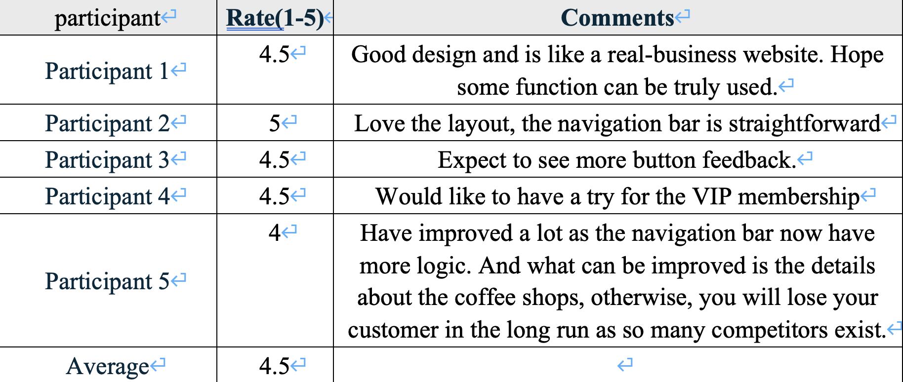
During the test, the expectations of users are high for the full presentation of the site as it looks more like a real site than Figma prototype. However, the webstie is still in progess. So some function may not be used. For example, on the registration page, when the registration button is clicked, the user would like to receive an indication of whether the registration was successful or not. These problems will be fixed soon!
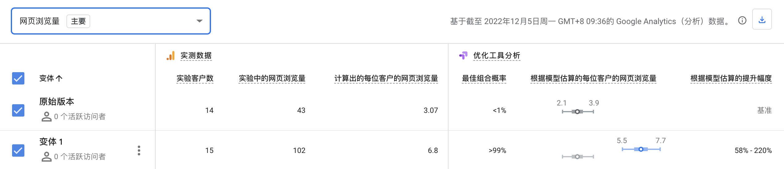
A/B test is designed to test whether a more detailed member profile will attract more website users to sign up as members. In this test, what remains the same is the sign-up prompt, including the title, e.g. "Sign up now and become our exclusive member", and what changes is whether or not to place the features and benefits of membership up front on the sign-up page to give more exposure to the benefits of membership, which might therefore increase the desire to sign up.
It is clear that Vabriant version 1 with the VIP membership benefits attract more click and trigger more event submissions.
Due to the time limitation, More data and detailed analysis results will follow!